Problem 01
Performance was hard to read at a glance.
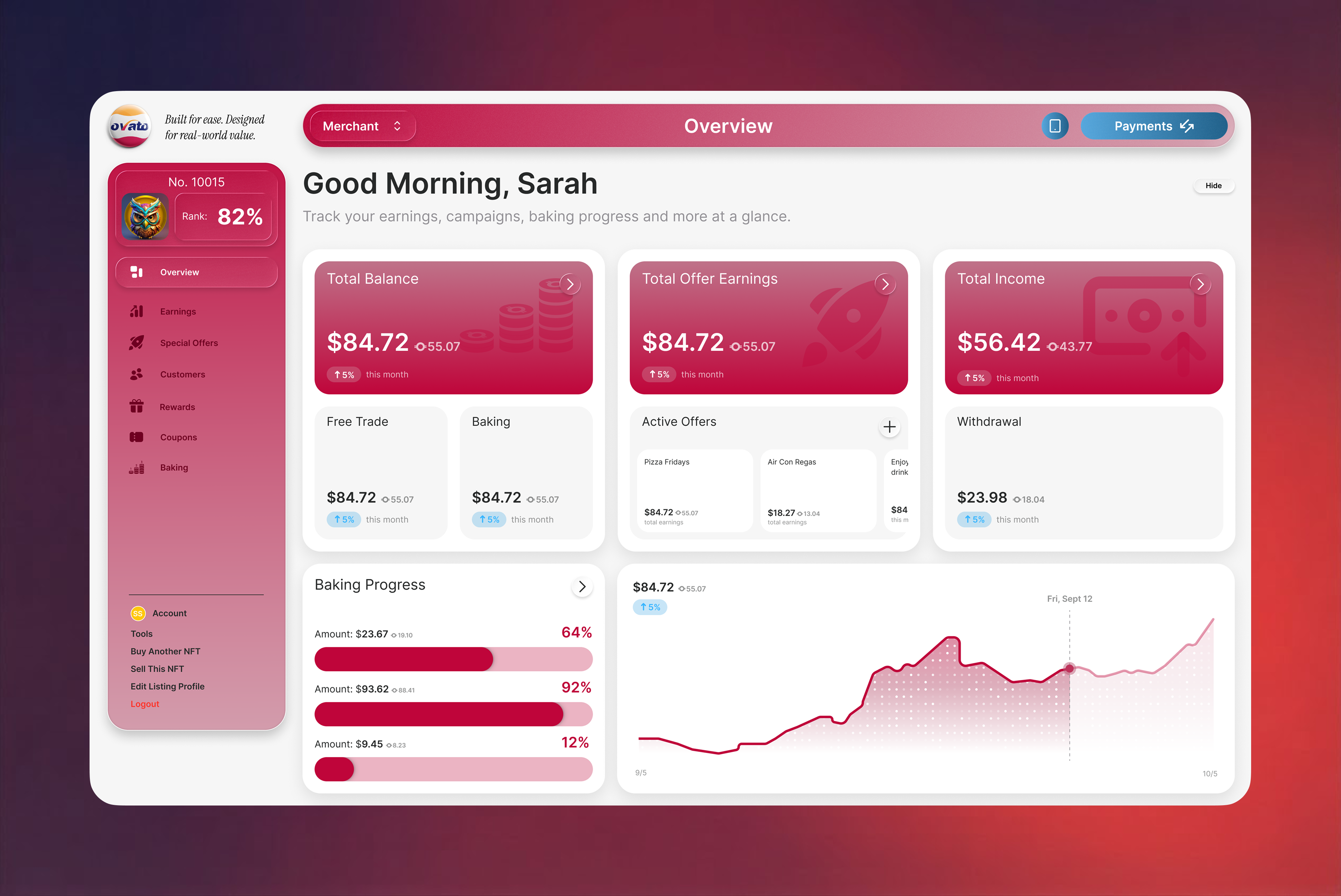
The existing merchant dashboard presented balance, earnings, campaigns, banking progress, geographic data, and transactions as separate dense panels with limited visual priority. This made it difficult for a merchant to understand their current performance, identify the most important action, or scan key information at a glance.
Solution 01
A dashboard built for decisions, not density.
I redesigned the overview as a clearer decision-support dashboard. I prioritised the most important financial metrics at the top, grouped related information into consistent card patterns, introduced more meaningful visual summaries for earnings and audience data, and placed actionable areas—such as active offers, baking progress, and recent transactions—within a more scannable layout. The responsive structure gives merchants a more immediate view of performance while making everyday actions easier to locate.
Problem 02
Premium identity still had to stay clear.
The website needed to communicate a credible, premium product identity while remaining clear, responsive, and easy to navigate across desktop and mobile screens.
Solution 02
A cohesive system that travels across screens.
I developed a cohesive interface system with a consistent navigation pattern, responsive content hierarchy, reusable UI components, and subtle motion. The visual direction balances an expressive, technology-led identity with legible typography, structured layouts, and focused calls to action.
Reflection
Craft is most useful when it supports a decision.
This project strengthened my approach to translating a complex product proposition into a clear digital experience. It reinforced that visual craft is most effective when it supports hierarchy, comprehension, and confident decision-making for users.